Genexplain Design System
Typography
A collection of font options and guidelines designed to establish a clear and engaging typographic hierarchy across the website.
Heading 1 – Raleway, regular, 42px
Heading 2 – Raleway, regular, 35px
Heading 3 – Raleway, regular, 24px
Heading 4 – Raleway, regular, 22px
Heading 5 – Raleway, regular, 16px
Heading 6 – Raleway, regular, 18px
Base font – Manrope, regular, 17px
Colors
A curated palette of colors and guidelines to ensure a cohesive and visually appealing design that enhances user experience throughout the website
Accents
#EFEFEF
Accent:
A soft gray used for subtle highlights and elements that require a gentle touch without overwhelming the design.
#000000
Accent Hover:
A deep black used to indicate interactivity, providing a strong visual cue when users hover over accent elements.
Contrast
#000000
Strong Text:
Primary text color that ensures maximum readability and impact, ideal for important information and headings.
#000000
Strongest Text:
This variant of black emphasizes critical content that requires immediate attention, such as calls to action.
#000000
Medium Text:
A slightly lighter black for secondary text, balancing readability with a softer appearance.
#626262
Subtle Text:
A muted gray used for less prominent text elements, such as captions or footnotes, ensuring they remain readable without drawing too much attention.
Base
#F5F5F5
Background:
A soft gray used for subtle highlights and elements that require a gentle touch without overwhelming the design.
#FFFFFF
Light Background:
A pure white background used for sections that require maximum brightness and clarity, promoting a clean and spacious feel.
Other
#2B6CB0
Link:
A vibrant blue used for hyperlinks, making them easily identifiable and inviting engagement.
#215387
Link Hover:
A darker blue for link hover states, providing a clear visual indication of interactivity.
#B3C7D6
Borders:
A soft blue-gray used for borders, helping to delineate sections without being visually overpowering.
Paddings
Padding guidelines specify the spacing between sections and elements, creating a balanced and user-friendly layout across the website.
Between Sections
Top – 80px:
Top padding creates a distinct separation between sections, enhancing the visual flow and providing ample space for users to digest content before transitioning.
Bottom – 80px:
The bottom padding mirrors the top, ensuring consistency and preventing content from feeling cramped, allowing for a comfortable reading experience.
Between Elements
24px:
This spacing between individual elements promotes clarity and organization, preventing overcrowding and making it easier for users to interact with content without confusion.
Elements
This section details the design elements used throughout the website, focusing on the hero section and other page layouts to enhance user engagement and clarity.
Hero Section
Full with hero section with clear Headline and Sub-headline

Buttons
Standard view – White background with black text and borders
Hover – Reverse, black background with white text
layouts
This section outlines the various layouts used throughout the website, aimed at effectively presenting information and enhancing user interaction.
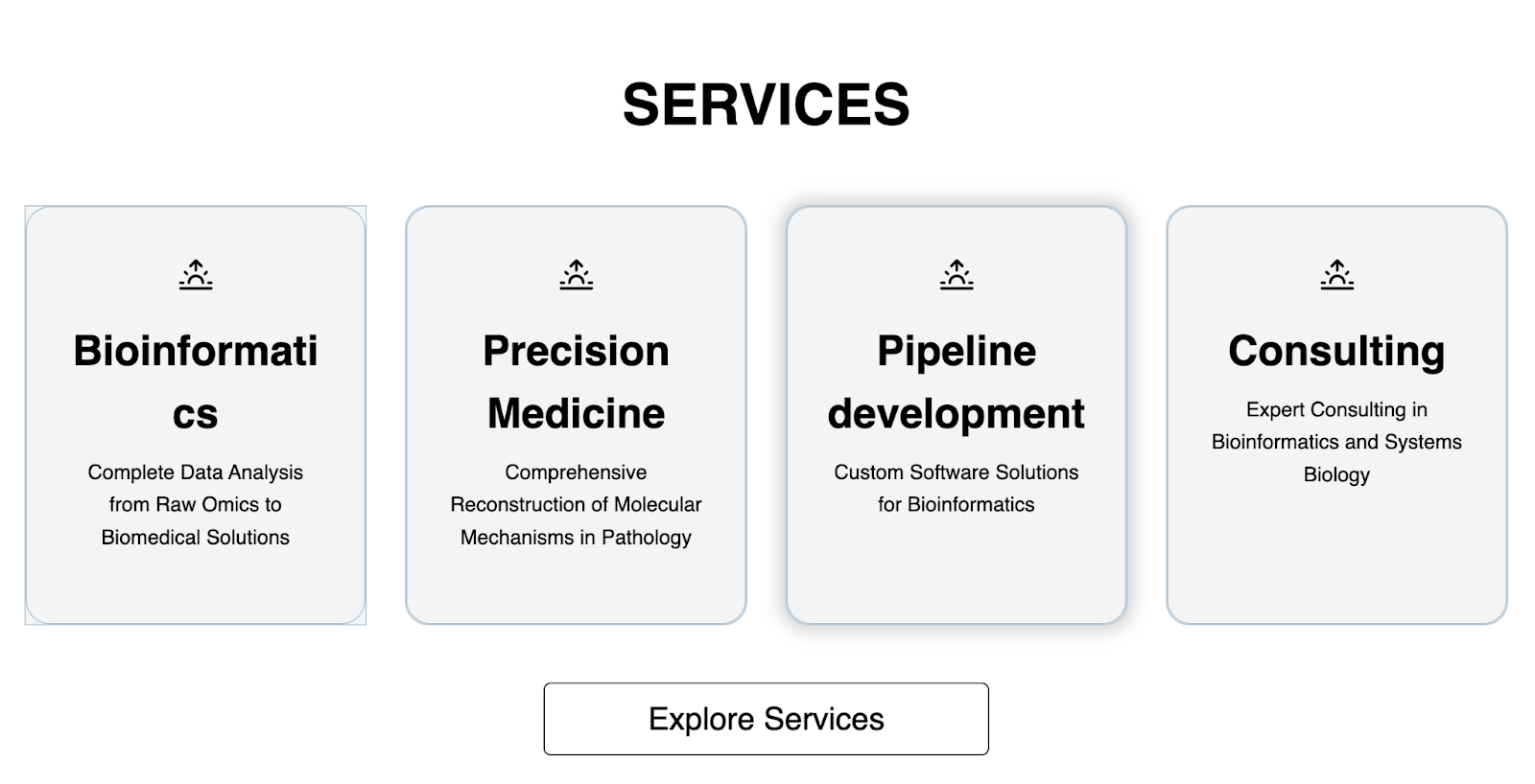
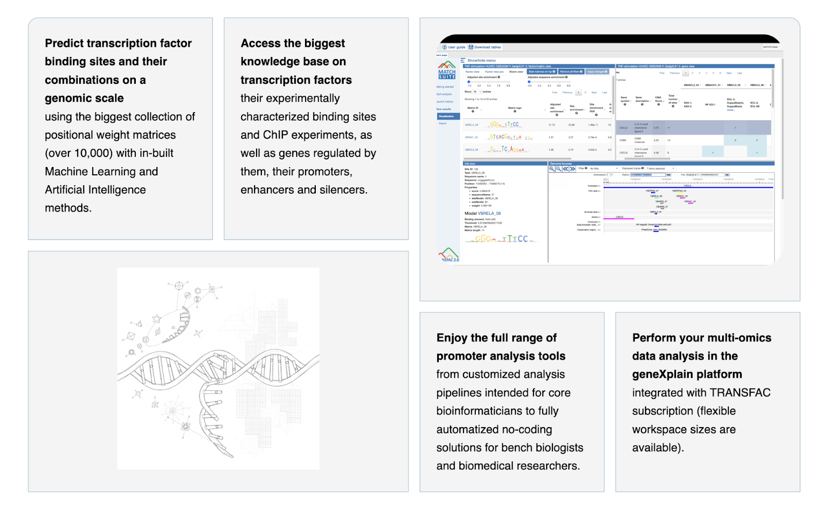
Bento box layout
Simple and adjustable layout to demonstrate your idea in just one screen
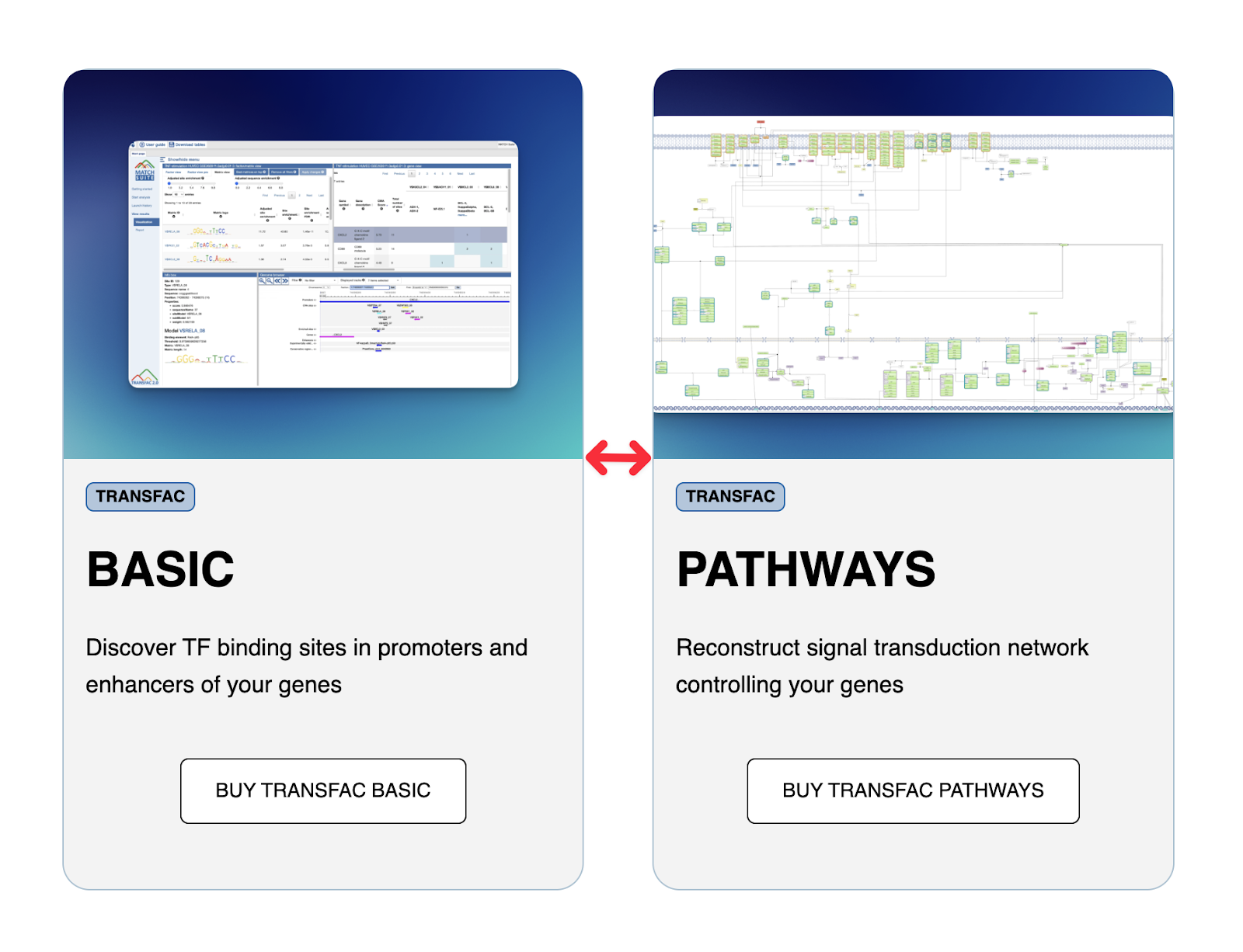
Comparison table
Long layout to compare complicated things
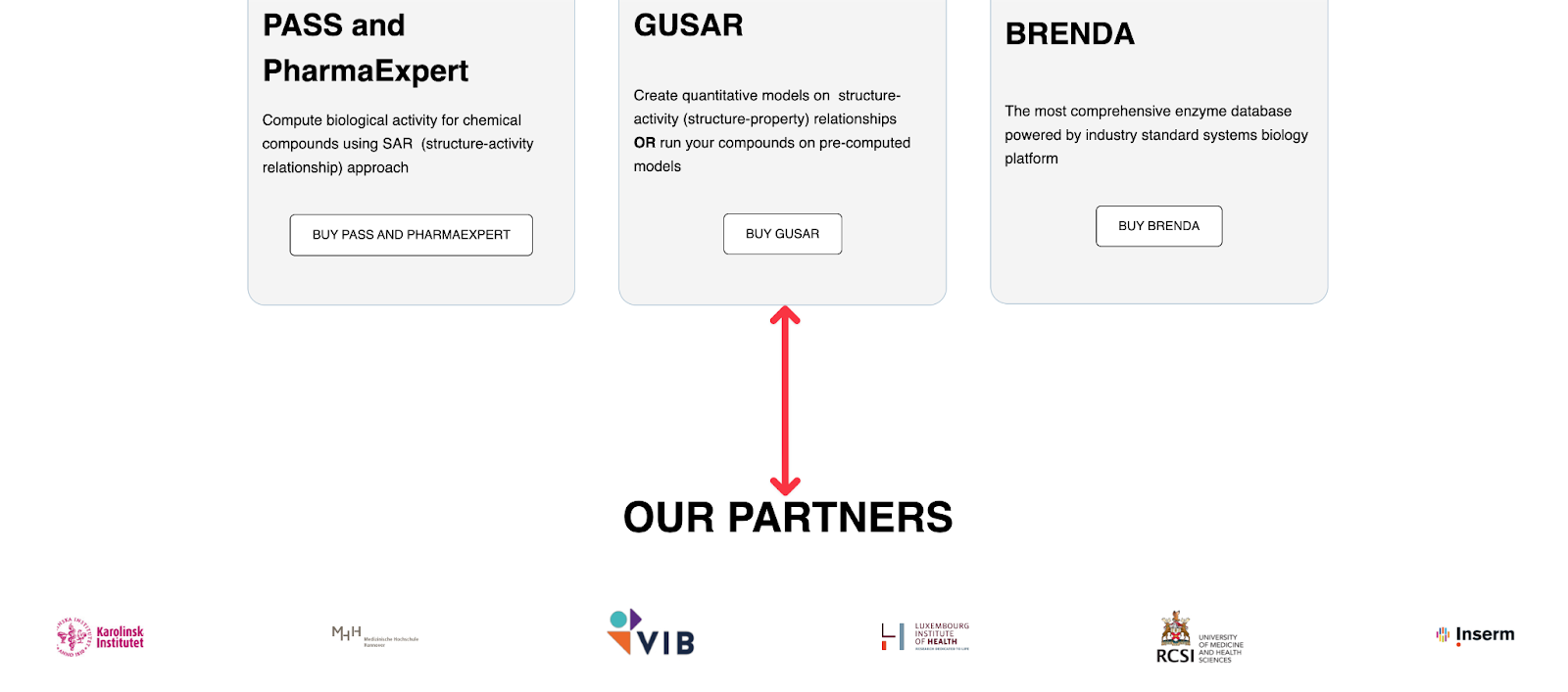
Item list
To collect all categories in one place